✌️ REVAMP IMPROVEMENT THREAD

This thread exists to collect all player feedback and suggestions how the newly introduced User Interface can be improved:


- Players ask for smaller sprites for overview
- Players want more contrasting colors and simpler unit sprites
-... (add your own suggested improvement(s) as a comment below)

b78//+


⚡ If you speak Dutch, join our Blitzkrieg alliance!
⚡ Questions about the game? Have a look at the Game Manual.


⚡ Need game support? Send a ticket or contact the crew.
⚡ Need map info? Click here.

Post a Reply

Please log in to post a reply.

52 Replies

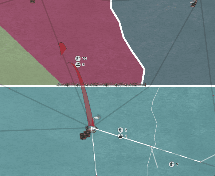
^Just to show how unclear the icon ordering can be


When they correct some of the issues with the new UI I think it will be great. So far Ive only played 1 day with the new UI, but when I switched back to Legacy mode it felt old. I think the new website makes it much easier to look at competitive stats/alliances etc. which is a great things, as this game is built around the community. Furthermore, itll help alot when this game gets introduced on mobile and on steam (which I think will bring quite a few new players/fresh meat).


The game has to be competitive but easy to use. It is a strategy game. If the new UI puts you at a disadvantage in comparison to the old UI you are gonna have problems (viewing troops etc.). So once I think those things are fixed itll be great.

I am going to make this as clean and simple as possible with a release that has been.. lacking


Here is a list of first impressions and what REALLY NEEDS to be CHANGED


1. When you have a huge empire you do not always have the time to click every unit stack to see what KIND of units are inside. Arty are not a tank and should not be shown as a tank.


2. I literally can not see where my units exactly are. I have tried even in Pin form and it is still nearly impossible to see where my units Actually are. Please give us the ability to see where our troops are again in a more similar way.. like legacy mode.


3. When I finally found my units I wanted to move then. Moving them was easy. However seeing the line showing the pathing was nearly impossible. I had to change my entire map mode to diplomatic relations map mode to even see the lines.


4. Please put back all the types of resources back on the map. Sometimes I am not looking for wood or iron and most of the provinces are not showing anything besides wood and iron? Why are any of the provinces showing no resources at all. I know you guys LOVE CALL OF WAR but there is a reason some of us did not want to play call of war.. please remember that. I watched my baby thirty kingdoms die already T_T


Now to the bright side of things.


1. The website is 100x better then before. I like the flow between games and the fact that I AS A CHAT LURKER. Can watch the chat even while not in a game at all. As a Ex GO I am sure all the moderators got a HUGE smile on their faces right now.


2. The new forum is better then the last forum. <--- The Plus Side

You have to register on to a new hosting service to use it <--- The Down Side


3. I love the new diplomatic map mode. It will be very useful especially with the in game alliances in effect.


4. I actually love the new way the map looks. Outside of the issues listed above. I love when you are at war there is barb wire and things... makes the game feel more real.. so if that was the goal good job.


Now I know half the game population wants me to say this:

PLEASE KEEP LEGACY

However I am not against change.

The change just CAN NOT uproot the die hard population of this game.

I hope the developers read this.


I really feel if these things are changed this new version will be beyond better then the first.

With the launch of mobile supremacy will in a new age.

I have hope even with literally not being able to stand to load the new version to actually play the game in its current state.


Legacy for me for the moment.

I look forward to these changes being made.


-D3athAngel


VJX4atk.gif


<3 Varien - The Valkyrie Trilogy <3


Long time Supremacy 1914 player and Ex-Game Operator of Thirty Kingdoms


;(May Thirty Kingdoms Rest In Peace;(

D3athAngel

1. When you have a huge empire you do not always have the time to click every unit stack to see what KIND of units are inside. Arty are not a tank and should not be shown as a tank.

Arty should always be shown if it's in the stack as we marked arty as most important to find there is a display order

1) Arty
2) then ranked on strength I believe

D3athAngel

2. The new forum is better then the last forum. <--- The Plus Side

+ 1000 000 as the EN Forum rat I approve this message xd

D3athAngel

PLEASE KEEP LEGACY

Keeping legacy around for ever would render the update useless there were also critical core changes to suport supremacy in the future

NarmerTheLion
ex - EN Senior Moderator


Questions about the game? Have a look at the manual and the FAQ's.


Need game support? Send a ticket or contact the crew.


Have an idea for the game? Check the BigList.

3ce873c6a7e0bb2ef51f9809b68745be.png


This is what it shows me. I have tried all the settings.


In the middle I have a group of 50,000 plus more arty but you cant see them at all.

VJX4atk.gif


<3 Varien - The Valkyrie Trilogy <3


Long time Supremacy 1914 player and Ex-Game Operator of Thirty Kingdoms


;(May Thirty Kingdoms Rest In Peace;(

D3athAngel

In the middle I have a group of 50,000 plus more arty but you cant see them at all.


I have found I have to refresh a few times often to get all my armies to show, hopefully this is a bug they will iron out


index.php?eID=image&uid=3891834&mode=2


At the moment i feel like the new user interface is giving me and my eyes too much information to handle. I like that the developers want to be innovative however, sometimes being innovative can cause the opposite effect. I'm happy that the developers want to try to improve the game in an attempt to attract more players and modernise Supremacy however after 1 or 2 days of looking at it there are some problems that i have come across:


1. The majority of players (Or what people are referring to as old timers) Enjoy the entertaining yet simple interface Supremacy has to offer. This "board game" interface was an example of this. I think the main problem people are having is that it's hard to differentiate between provinces, land and sea. When i'm zoomed out and trying to make a judgement its alot easier when i have clear borders and unit icons helping me distinguish my current position and any potential battle plans i wish to make. I'm currently playing as Greenland and its impossible for me to make such judgements. From what i can see the sea stands out a lot and doesn't really fit in making it a saw sight for my eyes, Not to mention i cant view routes on sea without dragging my ships which once again can lead to poor judgement and orientation. The old interface combated this perfectly offering a distinctive view of the battlefield with the colourful borders.


2. When viewing my battlegroups and naval fleets i can easily distinguish the number of men i have at my disposal however looking at the mech (for example which includes my artillery, tanks and cavalry) They all add up into one unit under an symbol of a tank. I can view the separate number of artillery, tanks and cavalry ect when i click on the army however the main problem is not being able to view the amounts of each unit i have without needing to select the army. It takes 2 seconds to check however its really annoying having to select every army all the time. Furthermore this links back to my previous point of offering poor judgement and orientation. It’s confusing and could be potentially frustrating and deceiving if i were to enter into battle restricting me from getting the best out of myself.


3. When moving units sometimes the unit icon will appear miles behind a border compared to where it's actually located. Once again im making a point about poor orientation and judgement. I would easily be able to get over it if i was merely moving troops around however when i need to shoot and scoot or make micro movements its going to become a problem :( Also when i'm trying to move them and drag the icon the location i want to transport them to is actually blocked by the icon which appears. Maybe a smaller icon or a pointed arrow instead would be a quick and easy fix.


4. When trying to view the cities in my provinces i can no longer “zoom in” to view the buildings i have constructed or the ones i can potentially construct. I know i can simply click the “province construction” tab on the side or in the province panel but being able to get a view of the town itself offers a better view. I know this may sound like something of my personal preference however a lot of players (both experienced and new) have told me they agree with me on this point.


These are the main problems i have come across the last 2-3 days of playing. im sure alot of other people have points they would like to make as well as more important problems but im just happy to be able to offer my opinion to try and improve the game for everybody while offering my insight. If i could sum it up i think the new user interface looks good and fancy however it limits my ability to make judgements. I hope the new problems we're faced with are fixed soon :) I dont know whats right and what's real, i don't know how im meant to feel anymore. When do you think it will all become clear? Because im being taken over by fear :(


Yours sincerely,

Mr Cuddles xoxo

won't somebody please think of the chat?


i can't have transcriptions of the chat just by copying it like in the legacy mode


if i try to copy it, i just get the messages without the username :(


https://www.youtube.com/watch?v=RybNI0KB1bg

The creation of new games also needs a bit of attention. In legacy when choosing your country you can easily see who is already playing where - now you only get the list of countries that have not already been chosen.


While this may seem logical I have always based my choice on a number of factors, one being who is playing close by me, is it possible to get the full list of countries back again so we can easily see which countries are already taken without having to click on them all in the map?


It's a fairly small irritation and I am sure we would get used to it but for me at least I do prefer to have all the information available at a glance to make the best decision regarding country selection.


index.php?eID=image&uid=3891834&mode=2


There should have been some consideration for handicapped accessibility.

The new UI has razor-thin scroll bars which are impossible for a person like myself to navigate. That is a physical problem, and it's enough to end my ability to play.

Then there are visual problems, including: The province borders are almost invisible, the nation colors are nearly all the same, and the 3d unit icons are confusing when near one another.

I hope the devs will recognize that they need to keep the handicapped in mind when making design upgrades.

S14 is a slow-motion strategy game, not a Playstation cinematic shoot-em-up!

I have an ideas for game:1) I think that need to add something like way of governor (Monarchy, Anarchy, Тeocracy, Respublika and ect.);
2) Forms of the state system (Federation or Unitary or Imperia);
3)Types of economic system
4)Rename the country and maybe cities;
5)Need to add emblem and for fun hymn));
6)Political regime (democratic or not democratic);


And for 1);2);3);6) - need to add pluses and minuses for country. If you think that this ideas good please send me a answer it will be cool if send me to my email.

b78//+

ggweorgiy

I have an ideas for game:1) I think that need to add something like way of governor (Monarchy, Anarchy, Тeocracy, Respublika and ect.);
2) Forms of the state system (Federation or Unitary or Imperia);
3)Types of economic system
4)Rename the country and maybe cities;
5)Need to add emblem and for fun hymn));
6)Political regime (democratic or not democratic);


And for 1);2);3);6) - need to add pluses and minuses for country. If you think that this ideas good please send me a answer it will be cool if send me to my email.

Lets first focus on the revamp new features will be looked at afterwards, best place to post them is in the missing features they will be polled there so that the devs know the approval rate of the ideas please read the "Read before posting" there

NarmerTheLion
ex - EN Senior Moderator


Questions about the game? Have a look at the manual and the FAQ's.


Need game support? Send a ticket or contact the crew.


Have an idea for the game? Check the BigList.

NarmerTheLion

Lets first focus on the revamp new features will be looked at afterwards, best place to post them is in the missing features they will be polled there so that the devs know the approval rate of the ideas please read the "Read before posting" there

I dont understand you mean that is the bad ideas or what, and send me a url of "Read before posting" please and you know some of ideas real cool like emblem and hymn

b78//+

ggweorgiy

I dont understand you mean that is the bad ideas or what, and send me a url of "Read before posting" please and you know some of ideas real cool like emblem and hymn

Those are all great ideas but this is a thread specifically about the new user interface that's been introduced and what tweaks/improvements it needs. What you are suggesting are changes to game mechanics, not the new UI. Please stay on topic.


⚡ If you speak Dutch, join our Blitzkrieg alliance!
⚡ Questions about the game? Have a look at the Game Manual.


⚡ Need game support? Send a ticket or contact the crew.
⚡ Need map info? Click here.

- When moving troops from water to land, I sometimes need to gather on the coast just outside the water. In legacy we can see if we're still sending them to water or actually on land by the 'embarking for...' that appears in the route. When determining a route in the new UI it doesn't display that message anymore so I don't know wether they're gonna go to the land piece of the coast or the sea piece of the coast.


⚡ If you speak Dutch, join our Blitzkrieg alliance!
⚡ Questions about the game? Have a look at the Game Manual.


⚡ Need game support? Send a ticket or contact the crew.
⚡ Need map info? Click here.

Make the flags show zoomed out.

I liked that feature in the old UI.

VJX4atk.gif


<3 Varien - The Valkyrie Trilogy <3


Long time Supremacy 1914 player and Ex-Game Operator of Thirty Kingdoms


;(May Thirty Kingdoms Rest In Peace;(

bring back renaming of leaders in game cause cant really role play with my username

british24

bring back renaming of leaders in game cause cant really role play with my username

I second this motion.

Customization is amazing.

Plus I don't want people to always know when they just got owned by yours truly.

VJX4atk.gif


<3 Varien - The Valkyrie Trilogy <3


Long time Supremacy 1914 player and Ex-Game Operator of Thirty Kingdoms


;(May Thirty Kingdoms Rest In Peace;(

Mr.Fleming

- When moving troops from water to land, I sometimes need to gather on the coast just outside the water. In legacy we can see if we're still sending them to water or actually on land by the 'embarking for...' that appears in the route. When determining a route in the new UI it doesn't display that message anymore so I don't know wether they're gonna go to the land piece of the coast or the sea piece of the coast.

This is a pretty important observation, you must be able to see exactly where your troops are sitting especially when on the beaches. The penalty for being in the water is to huge to ignore and when amassing troops especially to defend against a water landing you have to be able to place accurately. if there is no indication as to whether you are embarking or disembarking it will be impossible to stage your troops correctly


index.php?eID=image&uid=3891834&mode=2


british24

bring back renaming of leaders in game cause cant really role play with my username

Will be brought back

NarmerTheLion
ex - EN Senior Moderator


Questions about the game? Have a look at the manual and the FAQ's.


Need game support? Send a ticket or contact the crew.


Have an idea for the game? Check the BigList.

I have to say that I'm pretty appalled by NarmerTheLion's dismissive comments regarding the people who actually play this game. In S14 the way to get the World's Mightiest Army isn't to ignore casualties and throw resources away on barracks but to lose as few men as possible while steadily recruiting from offices. Similarly, the way to increase the player base is not to drive away longstanding players in the hope of attracting new ones. That's just bad PR - and bad business. The revamp as it stands isn't going to attract new players anyway. It doesn't matter how pretty a game looks, if it's not playable - and the revamp is so not playable - people just aren't going to play it. Period.


"I do remember a lot of people saying the same when we changed to HTML5 btw and in the end yes we lose some but a large number of the "I will certainly go away" stayed eventually."


There's a crucial difference here. The game was still playable in HTML5. With the revamp it just isn't.


"SO be it, it is a shame people leave due to this. But standing still was going backwards sadly enough"


Sorry, but the revamp IS a step backwards. You've taken a great game and made it unplayable. How is that progress ?


Three things are required by S14 players:


1) To see exactly what forces they have, and where they are, at a glance. Not by having to click on each grouping individually - life's too short for that. Legacy delivers that. The revamp doesn't.


2) To see exactly what forces their neighbours have, and where they are, at a glance. Not by having to click on each grouping individually. Legacy does that. The revamp doesn't.


3) The ability to see exactly where units are, so you don't put artillery in front of the units supposed to protect them, for example, or send units meant to guard a coast into the sea by mistake. Legacy provides that. The revamp doesn't.


Until the above fundamentals are addressed suggesting improvements to the revamp seems like a futile exercise in turd-polishing to me. Far better to admit that it's a turd and go back to the drawing board with this one I'm afraid, making playability the priority rather than pretty graphics. Who is this game for anyway, the players or the graphics guys (who I suspect have never actually played it) hired to pretty the game up ?


I'd also like to highlight some crucial front-end problems:


It's impossible to register for or log into this new forum on a square screen monitor. (I suspect that means that a lot of players have not been able to comment on the new interface - and a lot of those who haven't found the legacy option button on their own seem to have just left the games they were playing in).


With game information/numbers etc. being in image rather than text form it's now impossible to copy and paste game numbers into PMs. This is crucial when trying to communicate with guys who are in multiple games.


In conclusion, I can only hope that someone more concerned with the company's bottom line than pretty graphics rules that Legacy is maintained, at least until the above fundamentals are sorted out. Otherwise the player base will experience a complete carnage, I think. At the moment, as soon as Legacy goes, so do I - and it's pretty obvious from the comments on this thread that the vast majority of players feel the same way.

Post a Reply

Please log in to post a reply.

Back to Archive
Quick Launch