
CHAPTER TWO --- WHY EVEN DO THIS
I was proficient in the old design by ten years of practice. Obviously, any switch to a new UI is going to take adjustment on my part. These are issues, however, where I feel like functionality was simply scrapped without replacement or changed in ways that appear objectively unneccessary and, importantly, where functionality has been lost that was integral to the gameplay of someone playing the game at an advanced level.
Edit in 2025: I can't believe these are still relevant. I honestly can't. Even without the sprites, I still can't imagine a more cluttered, imprecise way to present a board game. At this point, this must be a social experiment.
2.1 - The map view is disorienting
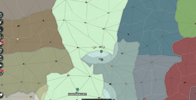
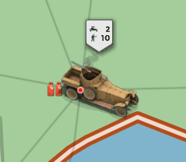
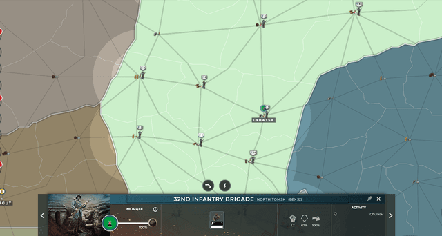
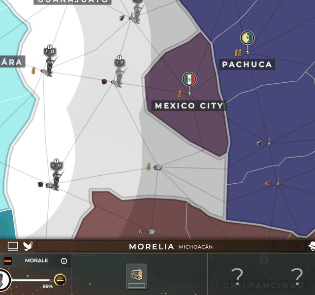
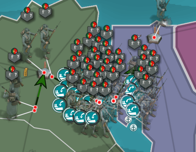
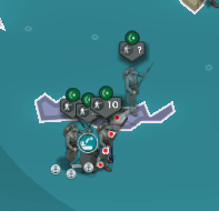
It is absolutely not unusual for new players to take a long time to understand the concept of a unit's location on the map. The large sprite, which does not offer that information in itself because it is offset from the actual location, naturally draws attention to itself. This is even reinforced with the unit's "tag" pointing right at those sprites. It is unintuitive that these two vastly most prominent features of a unit's display do not correlate with where it is on the map. I am not a "new player", I am aware that the unit's actual location is the tiny red dot on the map. But even so, when looking across a country from a little bit of a distance, this sort of display is simply disorienting because my brain has to correct for the misleading information that the two features it percieves strongest provide.
The Legacy client in contrast provided all of the information on a unit or stack of units bundled in the exact location on the map whenever possible and had active provision in place to still make it easy to read at a glance (see 1.2) whenever the simple solution could not be used. It makes more sense to the neutral observer that the location that a game piece would be displayed most prominently is in its actual location on the game board of the game it is a part of and the new client fails to do this while the previous one was especially good at it.
Re-design unit icons in a way that emphasizes the informative contents of them: Unit types, unit numbers and unit locations. Aspects which are qualified to distract from these three informative values of a unit icon are to be avoided as this robs clarity across the entire UI during almost the entire playing time. See chapter one.
2.2 - The resource bar
In the top bar, the resource and money stocks are now rounded and shortened. This is one of these where the change seems incredibly unneccessary to the overall appearance of the game but hurts "advanced" gameplay for no apparent benefit.
It is annoying enough on it's own that I have to mouse-over to see the precise amounts instead of having the "at a glance informative value" anymore, especially if I want to know the exact stock amounts on several resources, having to mouse-over every single one of them individually.
What makes this especially irritating however is how that mouse-over does not work when there's a tab open. It often happens that I want to know the precise stock amounts that I have of something when I'm hustling on the market to maximize efficiency or the exact time a stockpile will last when I'm fiddling with the sliders. To do this now I have to 1.) close out of the market tab and 2.) mouse-over the resource, 3.) memorize that amount like an animal or something and then 4.) re-open the market tab, 5.) repeat for next resource or to see how long the stock will now last and then readjust. In the previous client, it went 1.) glance upwards and maybe 2.) mouse-over to see how long the stock will last if in critical area.
This can objectively be called a major loss of playability for a minor difference in appearance.
Thankfully, the fix is simple: Return to the full numbers in the top bar instead of the "x.xK" format. And might as well have that mouse-over work while tabs are open like it gracefully did in the previous client for extra credit.