I personally really like the new look of the games.... I love the way each image stands out and is more unique.
5 Sept 2017, 13:47


As frontline pioneers you are able to see our upcoming update for the game management. You will automatically see those changes if you click on 'My games' or 'New games' as a frontline pioneer. Please let us know here if you have any questions or if you want to provide feedback!
- Sasri
Please log in to post a reply.
I personally really like the new look of the games.... I love the way each image stands out and is more unique.
This is easier to read, but the title of this post gave me the impression that there was some kind of company management change going on at Bytro.
since the number of players is already marked between the stars, it need not be mentioned also in the title of the game in these super large characters.
suggestion: removing the number of players from the title will make the label more clear and readable.
Being the conservative guy that I am, I'm sorry, but I didn't like it. It's just not the look I am used to and it obfuscated the info simply because it was in a different format that my brain didn't incorporate yet. Fortunately, I know which game is where (in which position, like "second one in the first column is that guy Libya invading my Turkey") almost any day, so it was no real trouble.
I'll get used to it in just a few days though, and then it will be just as clear as it always was. Not better, not worse.
Just wondering though, why didn't you finally include the name of the country you are playing in this overview? It is obviously the most useful piece of information that is missing.
Can there be an option to revert back to the old one?
Would prefer to use it over the new one.
I like the old look better.
I hope the Call of War admins and programmers are willing to change it back.
Thanks for the feedback already, guys 
Sadly not. If there is something concrete that you do not like, you can of course voice your opinion about it and we will evaluate if we want to change that aspect.xXCooksterXx wrote:
Can there be an option to revert back to the old one?Would prefer to use it over the new one.
Good news, this was already changed. You will see it once it is released to the live servers._Pontus_ wrote:
since the number of players is already marked between the stars, it need not be mentioned also in the title of the game in these super large characters.suggestion: removing the number of players from the title will make the label more clear and readable.
We also like that idea, but our website does not know about the country you are playing ingame. The rework that it does is rather difficult. Maybe in the future.K.Rokossovski wrote:
Just wondering though, why didn't you finally include the name of the country you are playing in this overview? It is obviously the most useful piece of information that is missing.
i like the change myself colors are a bit off i think a more winter mix of white's and blue may be better however the ease to acess the games is still there so continue on guys damn the torpedoes full steam ahead
I have many problems with the new format, all having to do with available info...
the old format showed game id#, # of days played , which options had been selected, your country, and any description which had been put in by the creator right on the top level image. The new format only shows the fancy colorful cluttered map image and the type of map.
When you play 6-10 games at a time, it gets utterly infuriating to click on the bloody info button every time you want to see which game is which.
Also, on a slightly different note, the change in diplomacy menu to an info button that is required to be selected to see if the other guys have high command is irritating in the same way, especially without any notification of the change. just lost entire armies to people I thought didn't have it and had arty walking forward blasting me as they went while I was afk and my troops were retreating, whereas if I had known, I would have stood my ground and at least inflicted casualties on his troops.
I'd like to know why you folks thought the interface menu needed an overhaul; it was simple, easy to scan,and full of information without being cluttered... many companies would benefit from that methodology. Instead, you went the other way and joined the lemming parade bandwagon to fancy pictures with no info.
If you MUST go to a more cluttered colorful image to retain market share, can you PLEASE at least find a way to make the info show on the top level image again?
-C
i dont like the change i miss the icons for supply drop , frontline, etc
i will get used to it though
sometimes change is neccessary or we become stagnant
If not. maybe we can have the icons back on the front page?
I can't find my current games as easy as before.
Yeah... I liked the icons that indicated the details of the map.
It made everything much easier to read, and thus:
Scan for new games to join.
Thanks for putting the game id # back on the tiles in the game menu, very much appreciated.
The right side of the small window you put the game id in is empty, you could put reduced size versions of the game option icons there... and if they are too hard to see for people, you could make them various colors so you'd only have to know the color of the icon to know what the options are.
-C
personally I love it as you see now the selection of game and maps is more comfortable
1. I am absolutely for putting the icons back.
2. I currently have 6 or 7 games of which a number of 22 player maps and ... I really can't tell which from what. Hence this way of presenting your game overview is confuddled. Though the looks are OK, the crucial info needed to identify games at a glance is simply not there. That would have to be adjusted towards the old info display as much as possible.
Am I going blind or can I just not find any info on the game being ranked or not in the new label?
Can we have the old way of the player number back?
Instead of lets say:14/100
we have the old version of 86 open slots.
Thanks again for the feedback.
When searching for a new game you can still use the filter on top to filter for games using certain game options, then you don't need to scan for icons at all. And in the mygames page we brought the gameID back so you can distinguish between your games. I agree it is not the most optimal solution and in the future we may refine that further.Crash99c wrote:
I have many problems with the new format, all having to do with available info...the old format showed game id#, # of days played , which options had been selected, your country, and any description which had been put in by the creator right on the top level image. The new format only shows the fancy colorful cluttered map image and the type of map.
When you play 6-10 games at a time, it gets utterly infuriating to click on the bloody info button every time you want to see which game is which.
Also, on a slightly different note, the change in diplomacy menu to an info button that is required to be selected to see if the other guys have high command is irritating in the same way, especially without any notification of the change. just lost entire armies to people I thought didn't have it and had arty walking forward blasting me as they went while I was afk and my troops were retreating, whereas if I had known, I would have stood my ground and at least inflicted casualties on his troops.
I'd like to know why you folks thought the interface menu needed an overhaul; it was simple, easy to scan,and full of information without being cluttered... many companies would benefit from that methodology. Instead, you went the other way and joined the lemming parade bandwagon to fancy pictures with no info.
If you MUST go to a more cluttered colorful image to retain market share, can you PLEASE at least find a way to make the info show on the top level image again?
-C
Regarding the interface change: As far as I know we did not change anything in the diplo menu, or at least not on purpose. If you can verify that something really changed there, you can report it as a bug.
The problem is that most maps still use the same game options (especially the system generated ones always use the same), so using them to distinguish between your games is also not the most optimal solution. I think better would be to show the country you are playing, unfortunately that is technically not possible right now. But maybe in the future. For now you may want to write down your gameIDs and make notes which is which._Pontus_ wrote:
2. I currently have 6 or 7 games of which a number of 22 player maps and ... I really can't tell which from what. Hence this way of presenting your game overview is confuddled. Though the looks are OK, the crucial info needed to identify games at a glance is simply not there. That would have to be adjusted towards the old info display as much as possible.
Why that? The new thing gives you more info, what the max number of slots is and how much guys already joined, and with some basic math you can deduct how many are still free to join. The old info only gave you half of that.xXCooksterXx wrote:
Can we have the old way of the player number back?Instead of lets say:14/100
we have the old version of 86 open slots.
For games I'm already in I just make a browser bookmark that links directly to a particular game and name it the country or something recognizable like Players League etc. e.g.
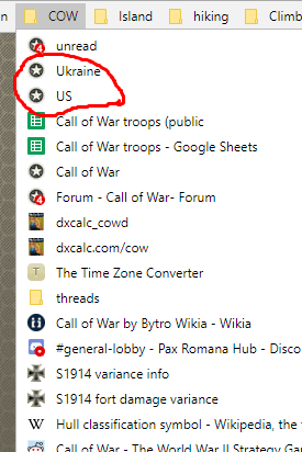 [/img]
Thanks for the reply and info freezy, but I still don't like the methodology of having to click on stuff to change options to find a game when I used to be able to just look at it and know which was which. I can function by game numbers alone, but I prefer the instant glance to know which game I want to select that used to be possible with the icons.
As for the diplo menu change, I wish I had a screenshot to prove it from a while back... been discussing it with some of the game mods I'm in a game with, and they don't remember either way... I'd wonder if I was imagining it, but I know for a fact that in several games being able to see it was instrumental in my being able to plan ahead for enemy behavior.
So I'm asking if anyone out there has a screenshot of the diplomacy menu from before with the separate column for showing the high command icon so I have proof of the change.
-C
P.S. - Just want to say that although I (still) have problems with the changes, I still love the game and will continue to play it, and want you dev's/designers/programmers to know that we all appreciate the work you guys put into the game to improve it
Please log in to post a reply.


