Call of War 2.0 Preview

Attention, General!

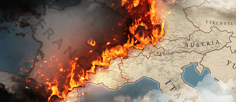
Exciting news! Today we will give you a glimpse of the upcoming visual redesign of Call of War. Together with the previous gameplay changes of CoW1.5 this visual overhaul will form the brand new Call of War 2.0!

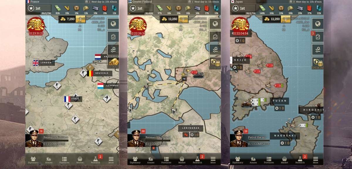
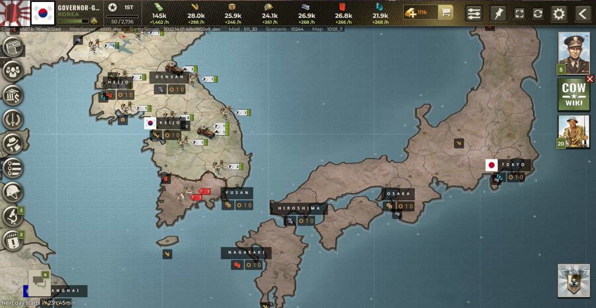
The visual overhaul contains two major areas: A revamp of the user interface and a redesign of the map itself. The new map draws inspiration from military maps of the time. It makes the game more exciting and gives you the feeling of commanding your troops on a realistic strategic map with real terrain elements merged into it.

The revamp of the user interface gives CoW 2.0 a state of the art, modern look. It makes navigating the game more intuitive by restructuring over 140 gameplay screens and menus. All adjustments were made with the platform you use in mind, whether that is on mobile or desktop. Switching between the two will become easier, with many visual elements now being shared.

Call of War 2.0 is scheduled to be released on all platforms on Tuesday, July 19th.

You can already check out all of the changes by switching to the Beta-Client in your account settings on desktop.

As a Frontline Pioneer (beta tester/player) you will automatically get a taste of the new map and UI on mobile and desktop, as they will be the default version in beta games leading up to the release.

Share your feedback with us here on the Forums and on Discord.

We look forward to hearing about your first experiences with the new client, until then best of luck on the battlefield!

Your Bytro team

UPDATE

We have postponed the planned release date for CoW 2.0 to the 20th of July. This will give us additional time for testing and QA.

Post a Reply

Please log in to post a reply.

124 Replies

I would like to test version 2.0, I contacted support and it was not possible, I think they could release this for players who ask, as it helps in the feedback. I have a team that has been playing for years ready to analyze this new version, we love the changes since 1.0, the game gets better and better.

@freezy

It.Pennywise
Moderador | Call of War
Bytro Labs GmbH | Suporte da Comunidade PT
Click para enviar um bilhete ao suporte.

Honestly, the only issue I have is the icon for rare metals. All the other icons make sense and I can understand them in the context of the game, but I find it hard to imagine the British air force needing 900 sapphires to create a division of interceptors. With the new UI going for the style of a WW2 war map, seeing a random blue gem representing rare metals at the top of the screen just feels a bit silly and doesn't really make sense in the context of WW2. Maybe reuse the old icon (like you did for Goods), or create a new one more similar to the old one?

Sulkia wrote:

Honestly, the only issue I have is the icon for rare metals. All the other icons make sense and I can understand them in the context of the game, but I find it hard to imagine the British air force needing 900 sapphires to create a division of interceptors. With the new UI going for the style of a WW2 war map, seeing a random blue gem representing rare metals at the top of the screen just feels a bit silly and doesn't really make sense in the context of WW2. Maybe reuse the old icon (like you did for Goods), or create a new one more similar to the old one?
Forum attachment
It.Pennywise
Moderador | Call of War
Bytro Labs GmbH | Suporte da Comunidade PT
Click para enviar um bilhete ao suporte.

The oil icon also doesn't fit. It looks like something you'd use to fill up your car, not tanks or planes.

WHOS GONNA CARRY THE BOATS?
WHOS GONNA CARRY THE LOGS?
THEY DON'T KNOW YOU SON!
- David Goggins

The new UI is not very bad, it has a lot of good new features and can be used to new map graphic but still i think legacy version has a better look.... so instead of installing a completely new UI, adding those new features and a new map design to the current UI this combination should have make much more better. New UI looks very sick to see every letters and numbers in bold and cap. And new icons don't make any better as others mention before.

Hope the new map is going to fix the glitches where units disappear sometimes - Calling it 2.0 might be a stretch however, more 1.5 with an gfx update since there is no new stuff.

You guys should really update the call of war wiki.

The Conqueror of Worlds

Also donโ€™t forget to join my alliance itโ€™s called Giant Problem & we are growing fast!

The Conqueror of Worlds

Please leave the current graphics as a playable option. The new version looks just like S1914 and I quit that game because of the graphics. You have a winning look right now; it ain't broke PLEASE don't 'fix' it.

Sidney Ruff-Diamond wrote:

Please leave the current graphics as a playable option. The new version looks just like S1914 and I quit that game because of the graphics. You have a winning look right now; it ain't broke PLEASE don't 'fix' it.
You can already quit because they will not change their plans!!! They will delete old graph and UI (legacy client)!!

WHy i cant sent messages to players? Not in game, but to an account out of a game. Look at buton โ€žsendโ€.

First impression: it is really hard to see the difference between terrain types. Forest is OK, but plain, hills and mountains are way too similar. Maybe, just maybe, I'll get used to it and "see" it when I train my brain for it, but for now, all terrain except forest gets blurred into one.

Also the "coloring" of nations is gone! How are we supposed to see who owns what, especially when there's a lot of border blur?

When the enemy is driven back, we have failed. When he is cut off, encircled and dispersed, we have succeeded.
- Alexander Suvorov.

"map controls" has an option to display nation colors, at least in the 4 games currently playing.

I hope the new map gets you the new players you will need to replace the old players that hate it.

This version is also quite good

I just saw the province list on the mobile app, and you should REALLY reconsider that one. On my screen (iPhone 7), only two-and-a-half provinces are visible. This makes managing production in an expanding empire virtually impossible. I realize the old situation with two tabs was a bit strange, but it is still MILES above this view! Please consider ways to reduce the row height, so more provinces can be viewed in the same screen!

PS - while you're at it, also please reduce the refresh rate of this one... it is really irritating that current sorting get cancelled all the time while you're working with this screen.

When the enemy is driven back, we have failed. When he is cut off, encircled and dispersed, we have succeeded.
- Alexander Suvorov.

Cannot say I'm overly enthusiastic about the new map.

It now feels like I'm playing on my mobile, awkward and unable to use all the sophisticated means I had at my disposal in Legacy.

Loss of joy in playing CoW may even have consequences for my continued presence here.

Grand Style Anticipation

Does the update only apply to new rounds, or also to existing ones? I don't see any innovations or changes yet. Neither via mobile, nor via desktop.

Some good posts in here. I appreciate that you all are continuously monitoring data to try to make the best decisions for the game. While many of the changes recommended here are interesting, I think the most impactful change is whatever brings in new players so that games can run more often (with fewer players going inactive) and, hopefully, more funding coming in to Bytro to continue to develop new enhancements and features--in this way, I think your interests and the interests of the current player base are aligned, and we should embrace any opportunities to potentially increase that player base. I trust your judgment on this and appreciate that you're taking feedback from your current userbase, and I trust that you'll continue to monitor the stats and make adjustments in the future if needed.

Is this intended to be the Beta client / 2.0 client feedback thread? I didn't see another one, but I only quickly scanned the other subforums so it's very likely I missed something. If it is, I'll list some of my own UI feedback here, but can move this to the proper thread if someone can kindly point me there :) . This is all on the PC version of the client; my app hasn't updated so I haven't seen the mobile version yet.

- I regularly play multiple games simultaneously. When playing on PC, I really appreciated that the play button in the old client would pull up all my games in separate tabs (so I could quickly open all my games). In the Beta client, please set the "Resume" button on the homepage to open the game in a separate tab rather than the same tab.

- Each time I open a game, the chat box is open and overlaying the map (see attachment). Please set default to have this chat box closed.

- My icons are blurry and hard to determine at a quick glance (see attachment). This is not improved by increasing my browser's zoom. I think the placement of information is something I can get used to, but I'd love it if the icons themselves were a little easier to read. (Also, I just noticed that it erroneously reports my stack is "under attack"--it isn't)

- Unless I'm missing it, the account overview / service record window shows PVP k/d but there's no toggle to see AI k/d like there was with the legacy client. This is sometimes handy for newer accounts that may not have much PVP history.

- It now takes two clicks to get to the Diplomacy window to change my relation with another country, whereas the old client got there in one click (I think--it feels clunkier, at least, and it's something I do several times per game so it was noticeable).

- [Edited to add one more]--when I'm directing stationary units to move, it was really handy for me to see the total move duration and not just the estimated time of arrival (for example, moving artillery that has just fired to wherever they can get to in 29.x minutes). The beta client only seems to give me estimated time of arrival, requiring some math relative to the current time (in attached screenshot, dragging the move arrow for this infantry shows me that he'd arrive at 4:13pm but doesn't tell me how long that is from now).

Positives:

- I LOVE that I can see k/d ratio for the current game. Really easy way to evaluate the threat of neighboring countries, especially towards late game.

- I haven't figured out how to best use the Armies window, the Map Controls window, or the Pinned Map Items window, but there seems to be some really helpful information there.

Again, if there are any video guides to making the best use of the Beta client I think that'd be hugely helpful to folks used to the legacy client. Maybe an idea for @BMfox if you're still making COW video content :)

please add so you can see how many units your unit has destroyed. You canโ€™t see it now in the beta version.

Also can you add to your profile so you can see how many of each units you have built?

็Ÿฅๅทฑ็Ÿฅๅฝผ๏ผŒ็™พๆˆ˜ไธๆฎ†

Post a Reply

Please log in to post a reply.

Back to Call of War News
Quick Launch