Sulkia wrote:
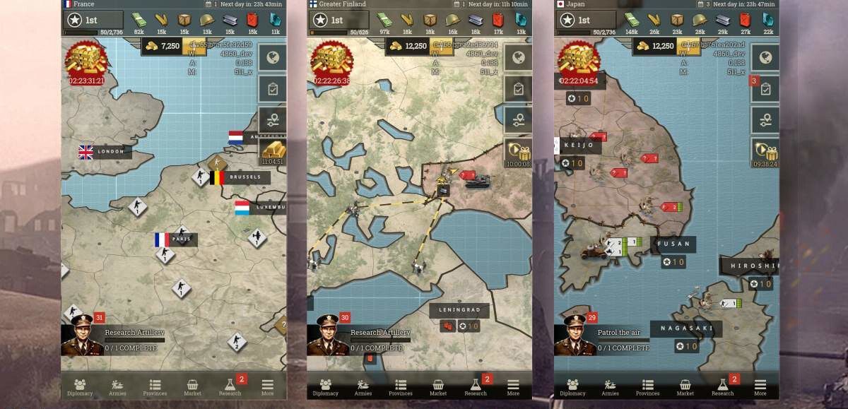
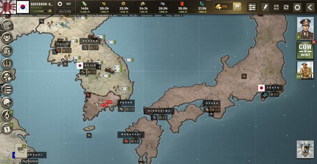
Honestly, the only issue I have is the icon for rare metals. All the other icons make sense and I can understand them in the context of the game, but I find it hard to imagine the British air force needing 900 sapphires to create a division of interceptors. With the new UI going for the style of a WW2 war map, seeing a random blue gem representing rare metals at the top of the screen just feels a bit silly and doesn't really make sense in the context of WW2. Maybe reuse the old icon (like you did for Goods), or create a new one more similar to the old one?
We will explore some other icon possibilities, but this won't make the July 20th release. So you will have to live with the new icon for a little bit at least until we (maybe) change it.
Erecon wrote:
Calling it 2.0 might be a stretch however, more 1.5 with an gfx update since there is no new stuff.
The mechanics update of CoW1.5 together with the graphics update we release tomorrow form CoW2.0. When we initially did CoW1.5 we actually planned to make it CoW2.0 immediately together with a graphics update, but we decided to do the graphics changes later and call the mechanics update only CoW1.5 for that reason. So it was the plan from the beginning to make a CoW2.0 with both elements together.
Jchicas the Great wrote:
You guys should really update the call of war wiki.
We will! But it will take some time.
K.Rokossovski wrote:
First impression: it is really hard to see the difference between terrain types. Forest is OK, but plain, hills and mountains are way too similar. Maybe, just maybe, I'll get used to it and "see" it when I train my brain for it, but for now, all terrain except forest gets blurred into one.Also the "coloring" of nations is gone! How are we supposed to see who owns what, especially when there's a lot of border blur?
Some improvements to terrain textures are still planned for the near future.
The coloring of nations still exist, there is a display option for it.
Z0ckt wrote:
Does the update only apply to new rounds, or also to existing ones? I don't see any innovations or changes yet. Neither via mobile, nor via desktop.
To both new and existing matches, but it will be released on July 20th.
jubjub bird wrote:
Some good posts in here. I appreciate that you all are continuously monitoring data to try to make the best decisions for the game. While many of the changes recommended here are interesting, I think the most impactful change is whatever brings in new players so that games can run more often (with fewer players going inactive) and, hopefully, more funding coming in to Bytro to continue to develop new enhancements and features--in this way, I think your interests and the interests of the current player base are aligned, and we should embrace any opportunities to potentially increase that player base. I trust your judgment on this and appreciate that you're taking feedback from your current userbase, and I trust that you'll continue to monitor the stats and make adjustments in the future if needed.[...]
Thanks for all the feedback in your post. We actually have a feedback channel on Discord.
Some of the things you mentioned are by design, others we still want to look into, and some are going to be fixed already. So overall it will still improve.
Destructo the Great wrote:
please add so you can see how many units your unit has destroyed. You can’t see it now in the beta version.Also can you add to your profile so you can see how many of each units you have built?
You can see how many units your army killed. Click on the army name in the army bar after selecting it.
Z0ckt wrote:
When will the latest version finally be released for all players?The news said that it would be released today on all platforms, on 19 July. So far I haven't seen anything. Both via the normal and the beta client, and there is nothing to be seen of official statements either.
A little more information would be desirable.´
Or is and remains that only for frontline pioneers?
We postponed it to July 20th, as the newspost and forum post says.
K.Rokossovski wrote:
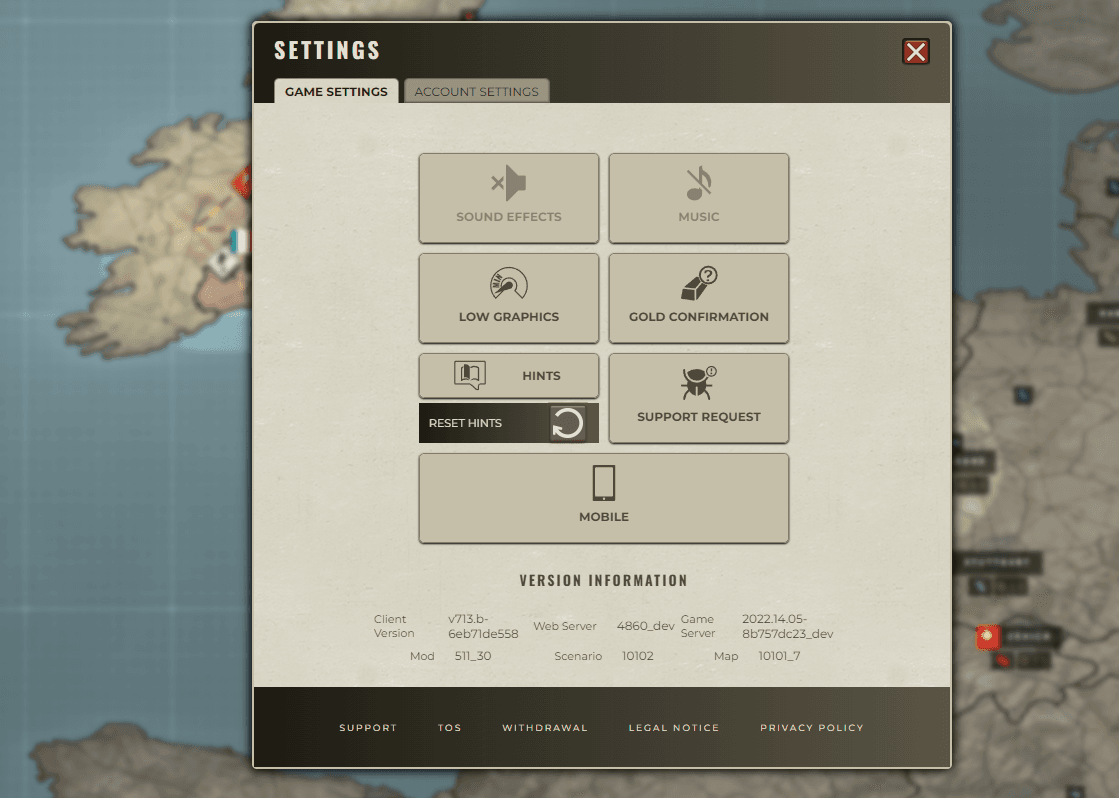
I just saw the province list on the mobile app, and you should REALLY reconsider that one. On my screen (iPhone 7), only two-and-a-half provinces are visible. This makes managing production in an expanding empire virtually impossible. I realize the old situation with two tabs was a bit strange, but it is still MILES above this view! Please consider ways to reduce the row height, so more provinces can be viewed in the same screen!PS - while you're at it, also please reduce the refresh rate of this one... it is really irritating that current sorting get cancelled all the time while you're working with this screen.
You can actually switch back to the old province list layout in the settings. Please view the attached images below.
The refreshing is a bug, should happen in the old client as well then, we will check.