i deicde to leave the game, it is full destroyed by the admins now i cant see the units like before the new update is the worst thing u could ever done to this game goodbye
12 Jan 2021, 11:00


Release Notes - 2020-12-15
Attention, Generals!
With our last update of the year, we implement new dynamic country names on the map and a Call of War wiki that you can access from within and outside the game!
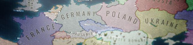
The new dynamic country names appear when you zoom out on the map and allow you to leave a visible mark in your game round. The bigger your empire grows; the more impressive your country's name will be represented on the map for all players to see.
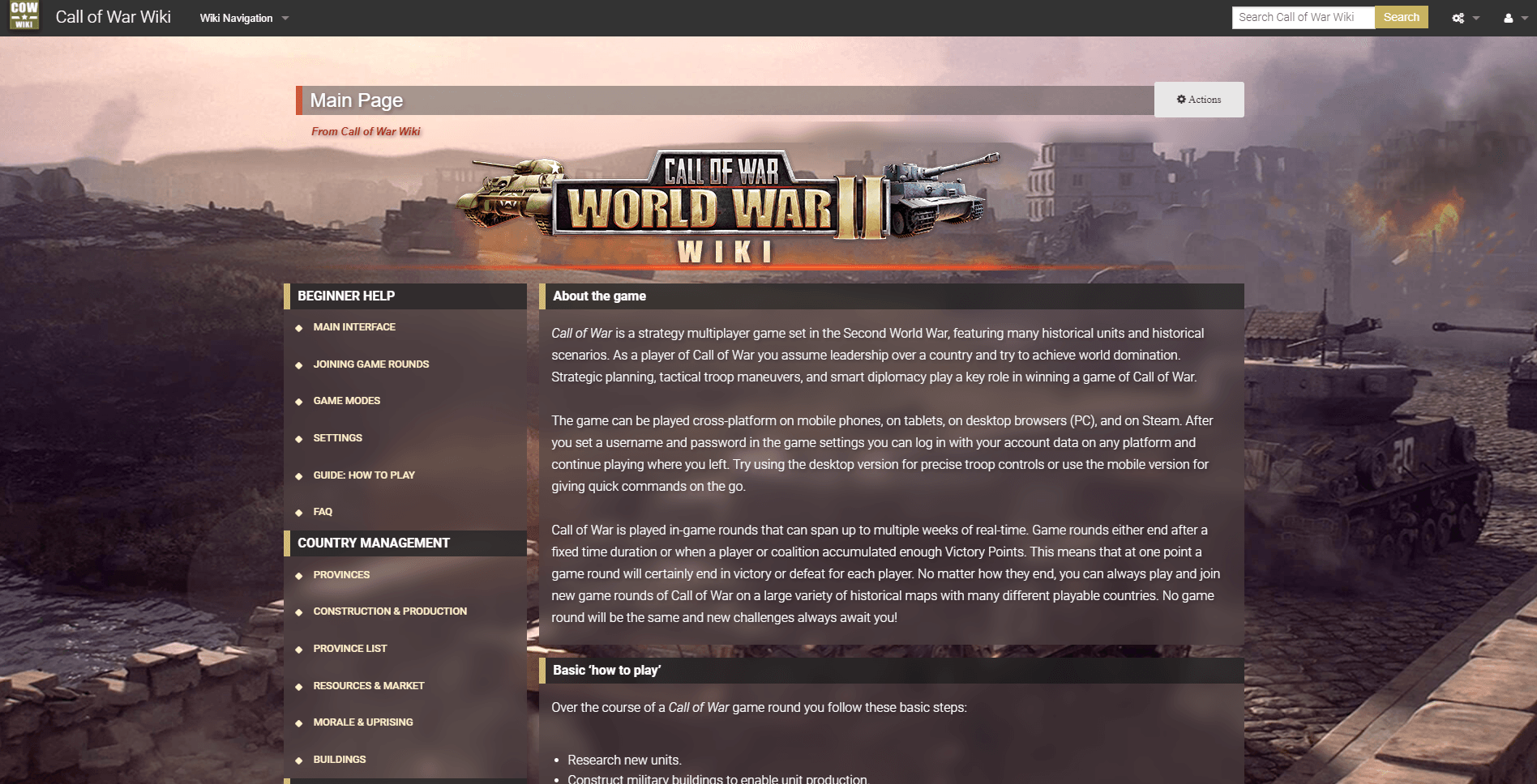
The new Wiki replaces the old manual and allows you to search for vital information without leaving the game. You will find a vast amount of information in there to a wide variety of topics, explaining the ins and outs of the game and its mechanics. Please note that we will add more content to the Wiki in the next few weeks.
Today’s update also includes some balancing changes, further updates and bug fixes. For a complete overview please take a look at the list below:
New features:
[list]
[/list]General:
Your Bytro Team
Please log in to post a reply.
i deicde to leave the game, it is full destroyed by the admins now i cant see the units like before the new update is the worst thing u could ever done to this game goodbye
wHOA there no dont leave
Hey, there is currently a bug that some players can't see any armies or army labels at all, we are investigating.The Queen Anne wrote:
i deicde to leave the game, it is full destroyed by the admins now i cant see the units like before the new update is the worst thing u could ever done to this game goodbye
Though I have to say this older news thread is probably not the right place to discuss this. For any further feedback on the newest update, please wait for the new news thread.
OK thank you. Luckily i am nit suffering
Hi,
This update has some serious visibility flaws.
The new army labels are not practical - or useful at all. They're actually incredibly annoying, and make it almost impossible to click my artillery behind my planes..
Example:
https://gyazo.com/3f3d32b2076a93205d60d00a97cd6634
You can barely see the second army beneath the labels.
As an immediate solution, please can you add a toggle to turn them on/off so we can switch them off for the time being.
Personally, I think this is another example of a feature that nobody asked for, nobody wants, and does not add any benefit... all it does is reduces visibility. Why are developers wasting time on updates that people haven't asked for?
I previously developed for a similar game, and for any new graphics update, we added an "update toggle" allowing players to toggle the update on/off as required while we refined it, and gathered feedback... rather than subject them to a flawed update like this
EDIT:
However, the "zoomed out" view (the Rhombus-shape of the army tag) of the army labels is a nice touch
game chat is knocked out and newspaper postt of the new update isn't there yet
Bugs regarding visibility of units with the new update are known.
Thanks for the feedback. You can click on the label itself to select the army, so just click on the right label to select your artillery. You can also hover it to see to which image it belongs, the hovered army and label are moved to the foreground then.ryanb96 wrote:
Hi,This update has some serious visibility flaws.
The new army labels are not practical - or useful at all. They're actually incredibly annoying, and make it almost impossible to click my artillery behind my planes..
Example:
https://gyazo.com/3f3d32b2076a93205d60d00a97cd6634
You can barely see the second army beneath the labels.
As an immediate solution, please can you add a toggle to turn them on/off so we can switch them off for the time being.
Personally, I think this is another example of a feature that nobody asked for, nobody wants, and does not add any benefit... all it does is reduces visibility. Why are developers wasting time on updates that people haven't asked for?
I previously developed for a similar game, and for any new graphics update, we added an "update toggle" allowing players to toggle the update on/off as required while we refined it, and gathered feedback... rather than subject them to a flawed update like this
EDIT:
However, the "zoomed out" view (the Rhombus-shape of the army tag) of the army labels is a nice touch
The new labels have new functionality and show army information that was not shown beforehand, so overall it will make the game easier to control and manage, after you got used to it. It is not only about looking fancy but also about showing more useful information.
Of course we will keep tweaking and optimizing it in future updates but we have no plans to remove it again.
What? Now all my units have a price-tag??
I'm sorry, but that is a butt-ugly change. Reverse it, please!
freezy wrote:
Of course we will keep tweaking and optimizing it in future updates but we have no plans to remove it again.
They probably won't reverse it, but I hope they add an on/off toggle.NoobNoobTrain wrote:
What? Now all my units have a price-tag??I'm sorry, but that is a butt-ugly change. Reverse it, please!
Thanks for responding FReezy.freezy wrote:
Thanks for the feedback. You can click on the label itself to select the army, so just click on the right label to select your artillery. You can also hover it to see to which image it belongs, the hovered army and label are moved to the foreground then.The new labels have new functionality and show army information that was not shown beforehand, so overall it will make the game easier to control and manage, after you got used to it. It is not only about looking fancy but also about showing more useful information.ryanb96 wrote:
Hi,This update has some serious visibility flaws.
The new army labels are not practical - or useful at all. They're actually incredibly annoying, and make it almost impossible to click my artillery behind my planes..
Example:
https://gyazo.com/3f3d32b2076a93205d60d00a97cd6634
You can barely see the second army beneath the labels.
As an immediate solution, please can you add a toggle to turn them on/off so we can switch them off for the time being.
Personally, I think this is another example of a feature that nobody asked for, nobody wants, and does not add any benefit... all it does is reduces visibility. Why are developers wasting time on updates that people haven't asked for?
I previously developed for a similar game, and for any new graphics update, we added an "update toggle" allowing players to toggle the update on/off as required while we refined it, and gathered feedback... rather than subject them to a flawed update like this
EDIT:
However, the "zoomed out" view (the Rhombus-shape of the army tag) of the army labels is a nice touch
Of course we will keep tweaking and optimizing it in future updates but we have no plans to remove it again.
I appreciate you may not have plans to remove it, but that should not be your decision. I think, from feedback on this & other forums, players don't like it - your decision should be driven by that. Please, at least add an off/on toggle for us to decide how we want to play it?
We had similar situations like this in the past, where we changed a graphical aspect in the game and there was immediate critisism afterwards. But fast forward 2 weeks later and no one complained anymore since most players got used to it. At that point if we wanted to reverse it probaboy most people would have complained again because they got used to it. That is the nature of things of how we tick as humans.
Therefore I am quite confident that also this time players will get used to this change and regard it as totally natural and fitting after a while.
This is a strategy game so showing strategic labels on higher zoomed-out views instead of pixelated unit images should come to no surprise tbh.
"players don't like it" is as true as "players like it". I saw feedback in both directions. Usually negative feedback is voiced in a ratio like 10:1 (general rule in the internet). But in the end we only see a handful of voices here in the forums so it is hard to judge what the great majority thinks about this.
What is certainly clear is that players need to get used to it and that there is also room fore improvement, so we intend to optimize the feature further. Your feedback will help, so if you have concrete things which need to be improved, please state them after playing a while with it.
If you absolutely hate the feature you can switch to the low graphics mode, which has it disabled.
I don't think I hate it anymore... maybe?freezy wrote:
We had similar situations like this in the past, where we changed a graphical aspect in the game and there was immediate critisism afterwards. But fast forward 2 weeks later and no one complained anymore since most players got used to it. At that point if we wanted to reverse it probaboy most people would have complained again because they got used to it. That is the nature of things of how we tick as humans.
I don't hate it, I just think it's worse than before. Cards instead of actual unit symbols just doesn't feel very "real", if you know what I mean.
I know what you mean, but we only replace those unit images when you are zoomed out quite a bit. On those zoom levels the units were already very pixelated and hard to see, so replacing them with clean images for easier control is the way to go imo. I think the new labels merge the realism aspect and the strategic planning aspect very well. Basically when you are zoomed in you are in realism mode, when you are zoomed out you are in strategic planning mode.
By the way we have a separate news thread about the new army labels now, so I suggest we continue over there and leave this thread be as it had nothing to do with this update.
tthe update isnt working for lower end devices like mine army labels aren't showing, and when i zoom out, units disappear completely
Please log in to post a reply.


